The Problem
Last tuesday my cloud infrastructure provider needed to reboot the physical HyperVisor where my virtual machine lives in order to upgrade the underlying operating system with fixes for the Spectre and Meltdown vulnerabilities. I was a bit worried as they said it would take 15 minutes but could be up to an hour if things didn’t go well. I was also worried because I had read that it could be up to a 30% performance hit and I wasn’t sure how that would translate from underlying Hypervisor through to my VM to the performance of the Runestone web application.
True to their word, the upgrade took 15 minutes or maybe less. But it didn’t take too long before I started to get a few emails from instructors letting me know that they were trying to create new courses but the process didn’t seem to ever finish. Sure enough when I looked into it I could see a bunch of timeouts in the task scheduler and a bunch of half baked courses in the build folder. I also started to get a couple emails from colleagues using Runestone asking if something had changed because they were seeing really slow performance in the classroom and in the grading interface.
Finally on Thursday I decided to do some quantitative investigation before opening an issue with DigitalOcean. The uWSGI server has a nice log file that keeps track of every API request and how long that request takes to serve. I have script that aggregates the data from the log, so I looked at times from before the upgrade and times after the upgrade. Bad News! The average latency had increased by a factor of 5 across all of the different APIs!
Wanting to poke at this further, and never wanting to miss a chance to practice a bit with Pandas and some of the other Visualization tools I decided to make a little graph to demonstrate to the support team my predicament. Here is what I came up with.
%matplotlib inline
import pandas as pd
import numpy as np
from altair import *
enable_mime_rendering()  # needed for plotting in jupyterlab with Altair
import matplotlib
import matplotlib.pyplot as plt
matplotlib.style.use('ggplot')
First I wrote a second script to create a csv file of the raw uWSGI log, that just contained the timestamp of the request along with the name of the API call and the latency (in milliseconds). You can see the first few lines of that below
df = pd.read_csv("../Data/ajax.csv",parse_dates=['tstamp'],index_col='tstamp')
df.head()
| api | time | |
|---|---|---|
| tstamp | ||
| 2018-02-12 01:05:41 | hsblog | 368 |
| 2018-02-12 01:05:42 | hsblog | 414 |
| 2018-02-12 01:05:42 | updatelastpage | 255 |
| 2018-02-12 01:05:43 | getuser | 773 |
| 2018-02-12 01:05:43 | getnumonline | 804 |
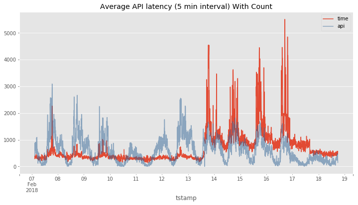
Next I used the resample method to compute the average response time
for each 5 minute period and I plotted it in red below. If you look
closely you can see there is a short gap between 13 and 14 and that
corresponds to the timeframe when the system went down for its upgrade.
The light blue shows the count of the number API calls during that same
timeframe. It was a happy accident that the y-axis in both cases matched
up in magnitude although the red line is in milliseconds and the blue
line is just a count of calls.
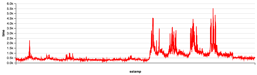
Its the red line after the break that shows the huge performance hit!
What is going on? Even under the same or smaller load the spikes show that the majority of the API calls were taking around 1 second in the best case and up to 5.5 seconds in the worst. I passed this diagram on to the support team and they escalated it to engineering. They offered to migrate my virtual machine to a different physical Hypervisor to see if that would help to allevaite the problem. Otherwise there was not much else they could do except suggest that I resize my droplet to a larger virtual machine.
plt.figure(figsize=(12, 6))
df.time.resample('5T').mean().plot(title="Average API latency (5 min interval) With Count")
df.api.resample('5T').count().plot(c=(0.2, 0.4, 0.6, 0.5))
plt.legend()
plt.savefig('avg_api_latency.png')
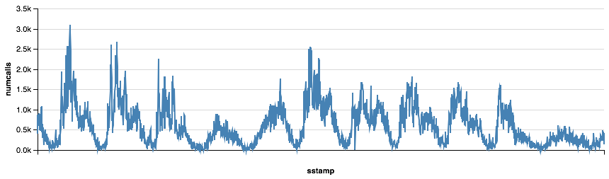
Visualizing with Altair
One of my students reminded me of the Altair visualization package in class the other day so I had to give that a try for graphing as well. It takes a bit more work to get the data prepared, but the graphing syntax is really powerful. I can’t see an easy way to combine these together in Altair but I’ll keep working on it.
foo = df.time.resample('5T').mean().reset_index()
foo['sstamp'] = foo.tstamp.astype(int) / 10**9
foo['numcalls'] = df.api.resample('5T').count().reset_index()['api']
Chart(foo).mark_line().encode(x='sstamp:T',
                              y='numcalls:Q').configure_cell(width=800)
Chart(foo).mark_line(color='red').encode(x='sstamp:T',
                              y='time:Q').configure_cell(width=800)
So, what is really going on? I have two theories.
- The easy way out is to blame DigitalOcean and/or whatever they did as a really bad fix for the vulnerabilities. I’d like to just do that and leave it there. But I can’t prove it one way or the other.
- The second explanation is a lot more complicated. First, I think I was close to the edge in terms of the sizing of my Droplet. I had four vCPUs on my machine and I could see that during peak times all four cpus were working to keep up. And they were, but just barely. Now if you slow those cpus down by 30% its quite possible that they were no longer able to keep up with the demand during that same peak. This caused the queue of tasks for the cpu to start to get longer and longer and therefore the time to complete an API task really grew. Review your queueing theory and you’ll see that this is exactly what can happen.
The Solution – for now
Last night I decided to take everything into my own hands and upgrade my droplet to six vCPUs by giving myself half again as much CPU power I should stay below the point where I get the crazy performance. I’d rather not do this as it doubles my hosting costs, but the upgrade is easily reversable if the performance continues to be really bad. I thought the resize would be nearly instantaneous as it just needed to reprovision me with two additional vCPUs and double my memory footprint all on the same Hypervisor. However… The reprovisioning took nearly 30 minutes. Long enough that I’m convinced that the upgrade caused me to also migrate to a new Hypervisor! I definitely don’t know enough about how all of this virtual machine provisioning works so I’m just guessing but I think that must be the case.
However, I’m happy at the moment as the API averages (under very low load) are actually BELOW what they were on my old machine pre-meltdown fix. Which is another reason I think I’m on different underlying hardware. What I don’t know is if I back off my resize and go back to 4 vCPUs will I stay on the same physical hardware or do I risk getting moved back into the slow situation? I’m not eager to do too much experimenting back and forth as I’m not keen on having downtime for no reason. In the meantime today is a holiday so the load is not very high and I’ll have to wait until tomorrow to see how it all holds up under a heavier load.
I’ll plan to update this post in a week to show how performance holds up to increased load in the next few days.
Comments
comments powered by Disqus